Initial Branding Process
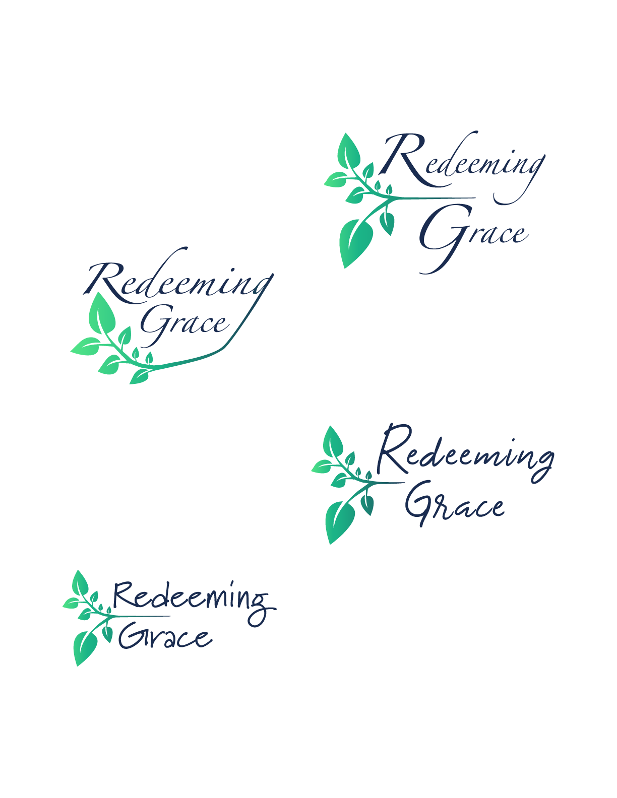
The first conversation with the Founder of Redeeming Grace Ministries began the initial branding of their ministry. After meeting with the client to discuss requirements and vision for their brand, multiple options were created to allow the client freedom of choice.
Requirements included a blue, green, and teal color scheme with a script font with long flowing characters. In the carousel, you will see the many different options given at the outset of branding.
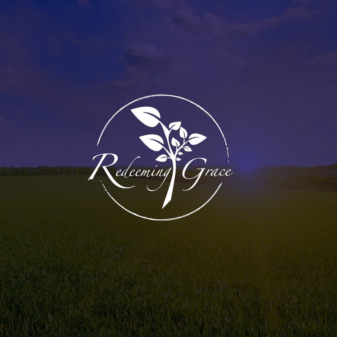
The client settled on the leaf design to represent the New Life offered by their ministry.
In order to condense the design, the words and circular shape of the logo were combined, producing the following result. Different variations of colors and textures were applied to see which one resonated the most with the client’s view for their ministry.
The client really enjoyed the gradient color scheme, with a full set of leaves on the plant in the design to thoroughly express the fullness of life that can be expected in recovery.
Website Development
For Redeeming Grace Ministries, the main objective of building a website was a place for donors to learn of their mission to help women struggling with substance abuse disorders. Captivating photos of potential clients were used to show what potential clients would look like, while engaging the audience in the meat and potatoes of their non-profit organization.
Their website conveys the hope behind their mission, meaning bright colors and warm inviting images were used to captivate the website visitor’s attention. The site is fully responsive and built in WordPress using a customized theme. With a Google PageSpeed Insight score of 84%, pages quickly load to reduce wait time for the user.
We are so blessed to be a part of such a wonderful endeavor! The following are snapshots of their website as it stands at the writing of this article.

