Curating a Brand Experience
When we sat down to speak with restauranteur, Jake Pfeiffer, we were immediately impressed by his passion for creating and delivering a high-quality restaurant experience for residents of Pulaski, TN.
A small town, burdened with history and trailing the prosperity of the flagship city (Nashville) for their state, Jake wanted to honor the tradition of the south. Kitchen 218 was to leave a mark on Middle Tennessee’s future, providing a local hangout for the nearby college students and aging townsfolk alike.
Concept Artwork
With an eye and two ears on Kitchen 218’s purpose, we set to work drafting potential concepts for the restaurant’s brand.
Through a dedicated revision process of Adjusting typography, iconography, and colors palettes, we teased our way through the graphic design process.
Cementing a Brand for Kitchen 218
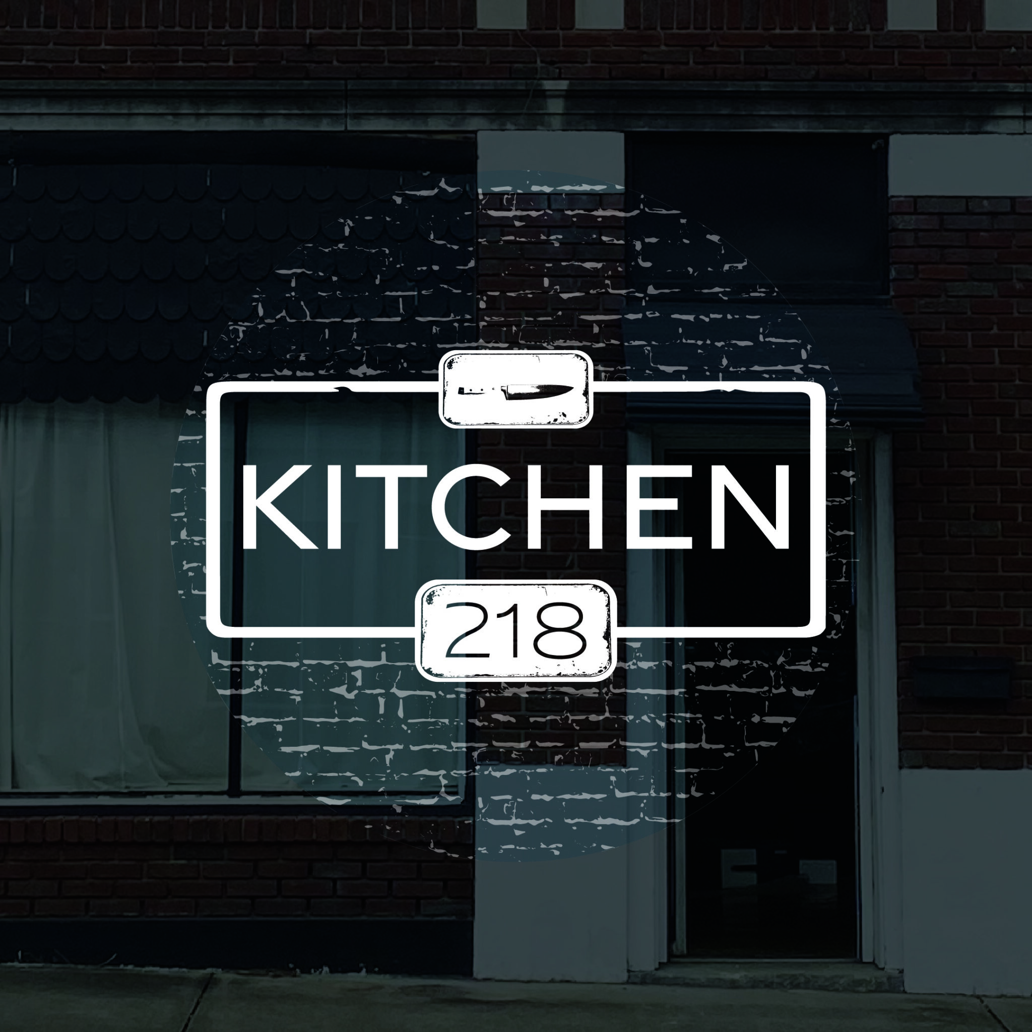
We travelled to Pulaski, TN to see the historic site of Kitchen 218. The red, brick building just off Main Street was the former site of an automotive dealership, and Jake and his partners were just starting the demolition process when we met. It was rustic. It was dirty, but it had life.
Pulaski is steeped in history, and Kitchen 218 means to honor that tradition, therefore, the restaurants’ branding incorporated the building and region’s legacy.
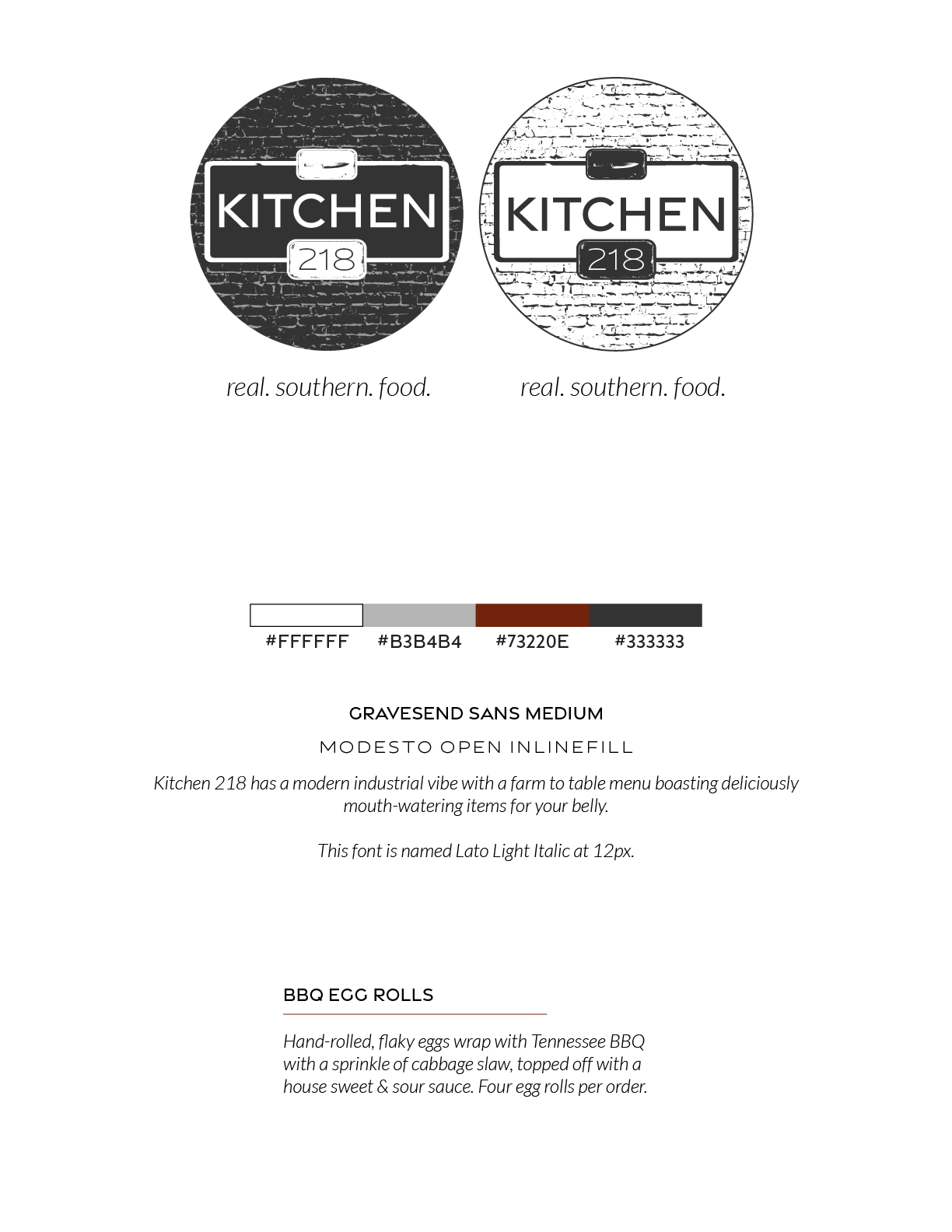
Flip through the following pages to view final concepts, typography and color options for the restaurant.
The Main Course at Kitchen 218
A brand is born.
With more communication and revisions with the owners, a complete style and branding guide was provided to the client.
One of our very first ventures into branding, the client receives frequent positive feedback from patrons. Kitchen 218’s branding enhances their overall experience, while paying homage to Tennessee traditions.