Avalon Family Care is a new family medicine practice in Madison, AL serving ages 2 and up. They address many acute and chronic conditions through an innovative approach to medicine – the membership medicine program.
Most physician’s have a lengthy patient waiting list, but as a member of the membership medicine program at Avalon Family Care, patients receive a personalized approach to medicine dedicated to curating a path for your current and future wellness.
As a start-up medical practice, Avalon desired the complete “bells and whistles” package from 21 ads media, and we were happy to oblige. Starting from logo creation and moving to website development, it was our pleasure to work with Dr. Finnila and his team at Avalon Family Care. As always, 21 ads media exists to create and help your small business plant its roots to propel future growth.
Creating a logo designed to attract clients
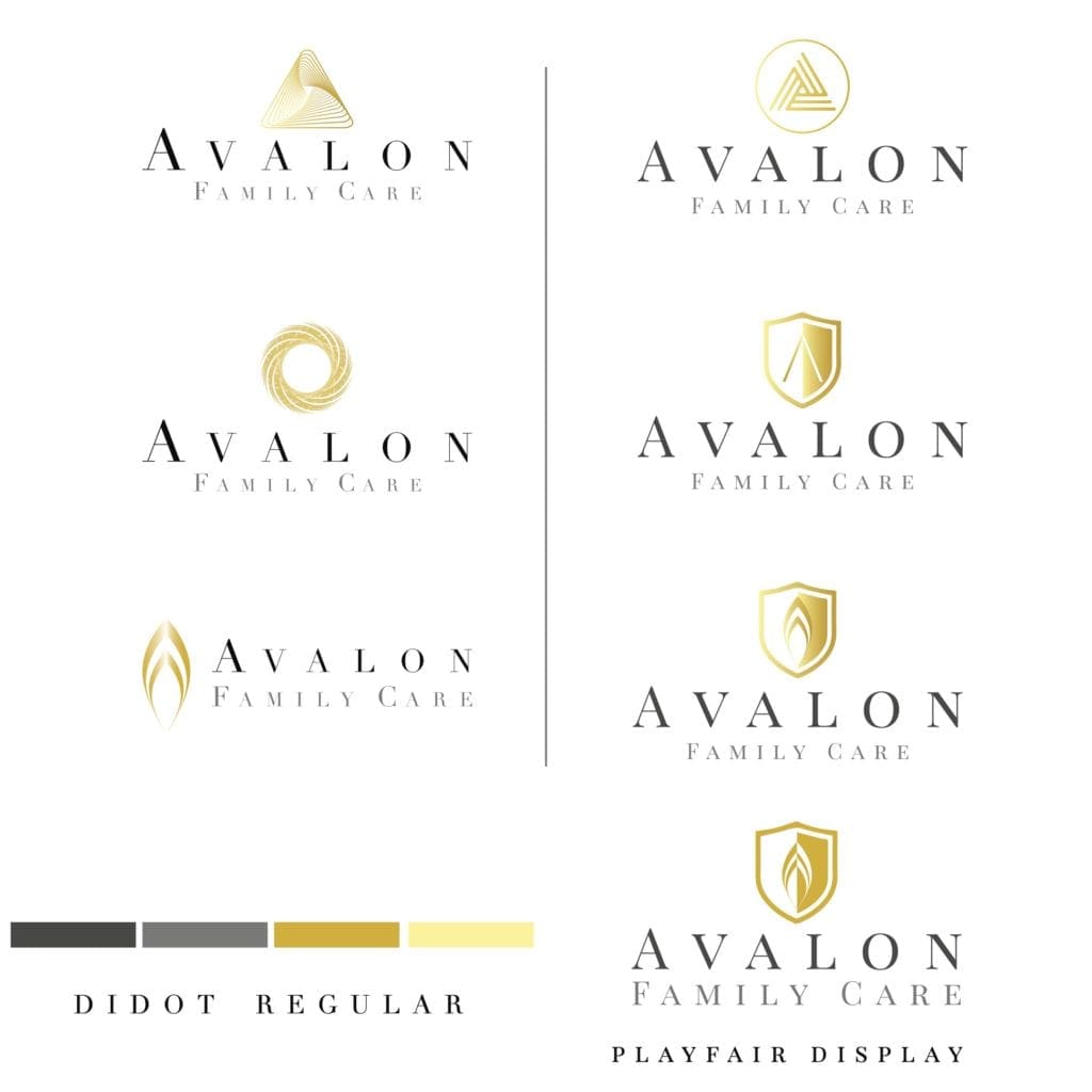
Shapes, colors, and typeface v1
To start the process, some ideas for an icon were thrown out just for fun and to test the waters a bit. To represent, the excellent quality of medical care provided, we thought a nice gold would be a good place to start in the logo (apparently not a great long term thought), and the bold choice of a serif font in all caps was eye-catching and very professional.
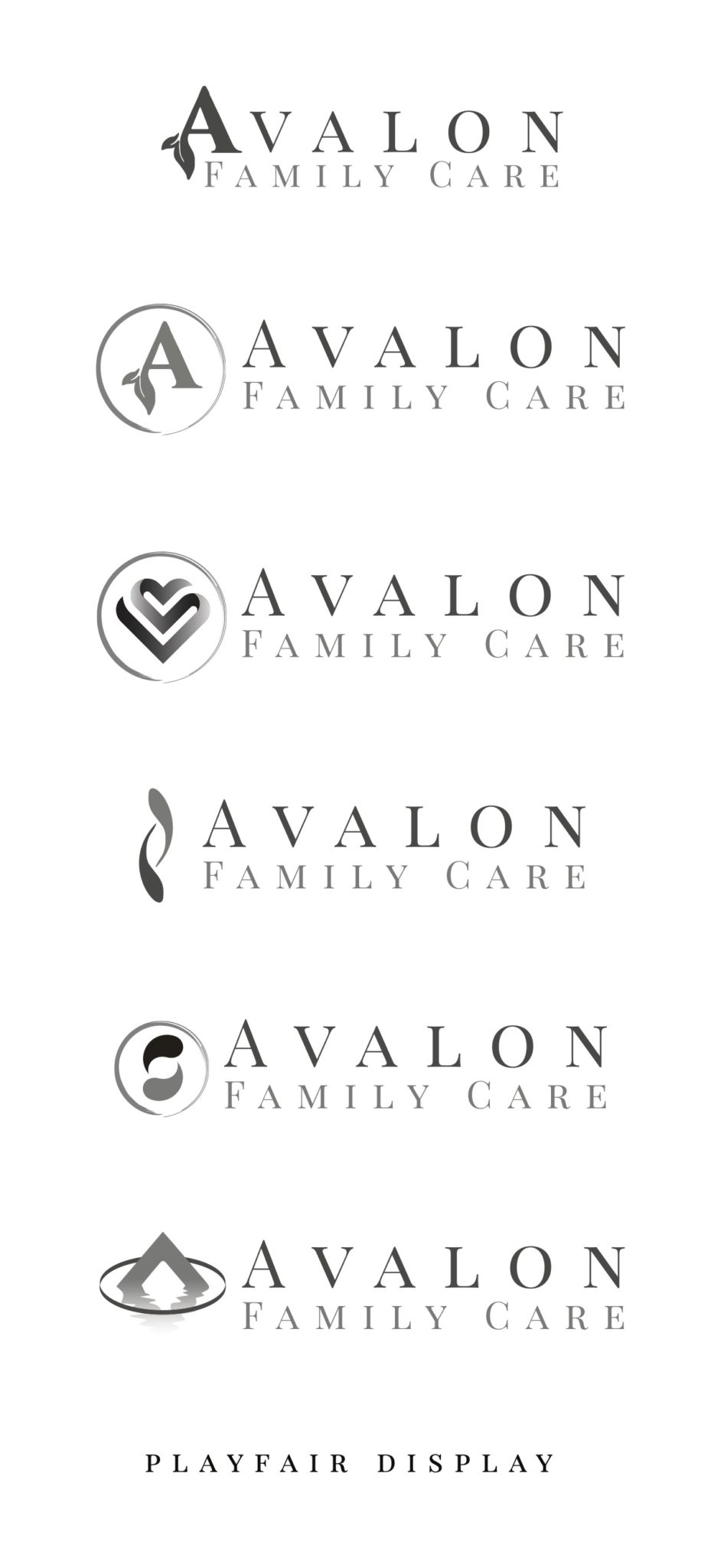
Icons and layout v2
After some revisions and feedback from the owners of Avalon Family Care, another round of icons were drafted. To remove the quandary of making too many decisions at once, colors were removed to focus on layout and the icons themselves. We find making simple decisions, one a time, during the creation process facilitates efficacy. For what it’s worth, the bottom layout and icon on this round of choices was our personal fave.
Practice makes better...
Sometimes it takes some time for ideas to turn into reality, and we don’t shy away from that conversation at 21 ads media. We’re here to guide you to a successful brand image, every step of the way.
More layouts, more icons, with some colors thrown back into spice things up a bit and offer a new perspective.
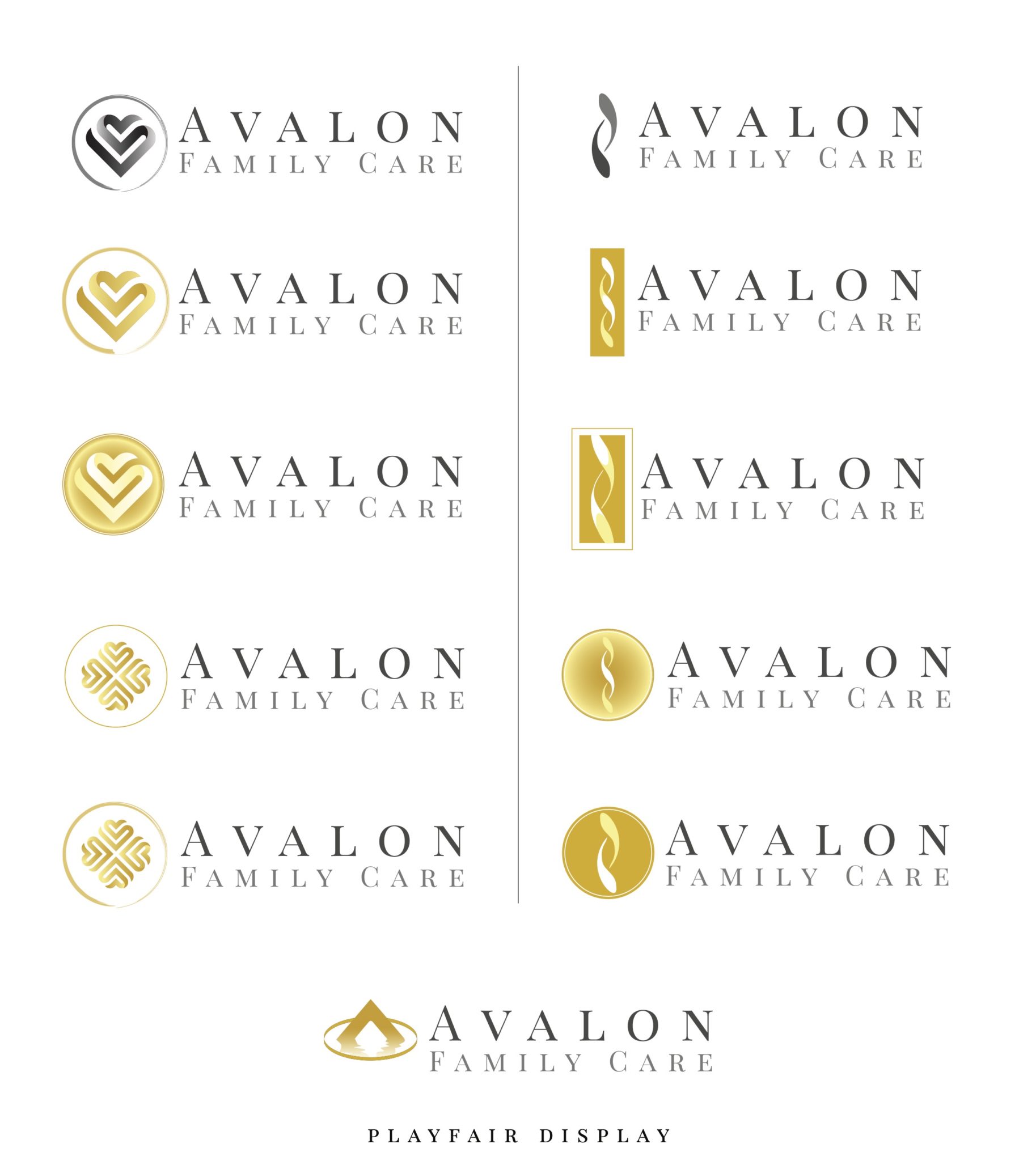
And we have an icon! Now for the all important color scheme....
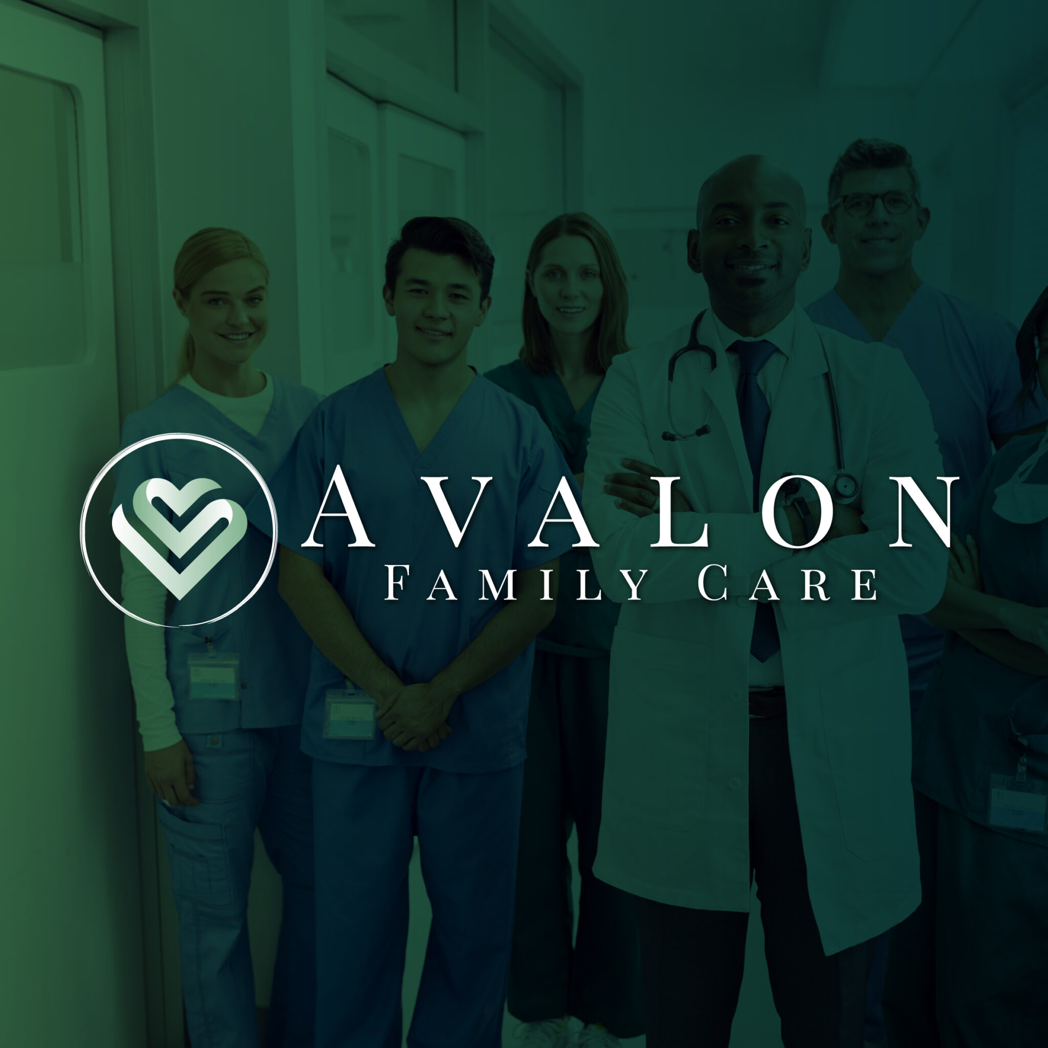
The heart was chosen for the icon and graphical representation of Avalon Family Care, and a horizontal layout was decided would look best for a digital web presence.
Next up, an array of colors was served up to the client to see a wide variety of emotional represented by their brand.
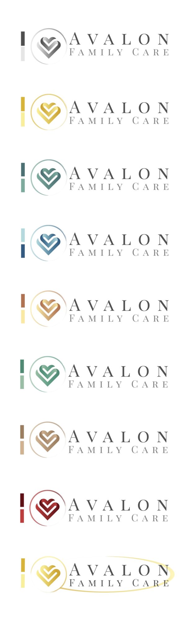
The green hue was the winner. Now to nail down some fine tuning.
Green gives a calming effect to the viewer and provides a stable, clear and calming connection the to viewer. From that vantage point, it was important to nail down some finer points in their logo.
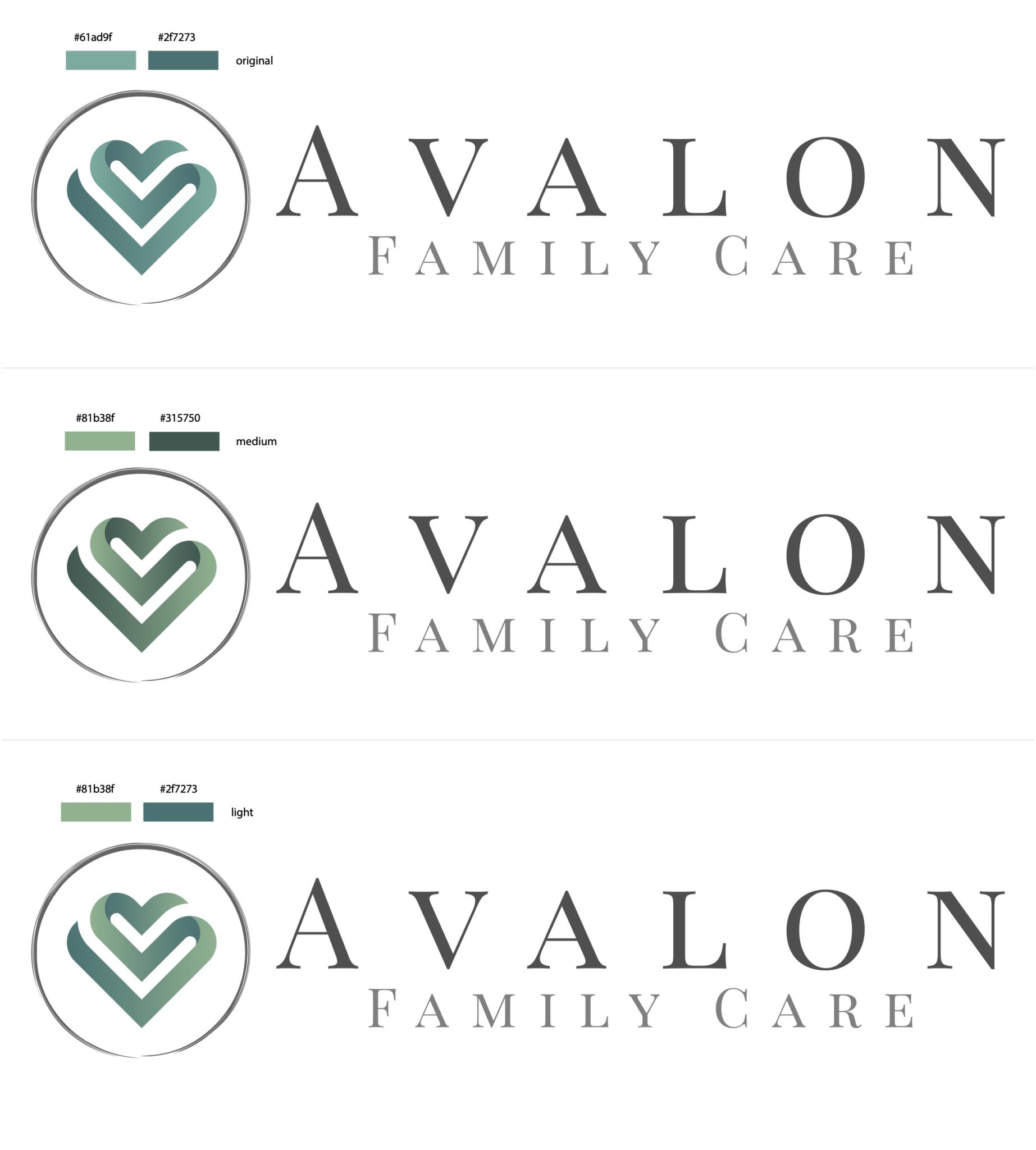
The winning choice and final logo:
We love, love, LOVE this logo, and the clients did as well. That’s always our goal at 21 ads media throughout the entire branding process. We want our clients to fall in love with their visual representation of their company. If this is the case, most likely, the clients will as well!
